Step by step designing a bookplate
Here I'm going to try to go into as much detail as I can showing how I go from idea to finished bookplate!
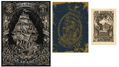
Nautical bookplates are incredibly popular in bookplate pictorial history so it was only natural I started gravitating towards this theme when I was thinking about my Fantasy range of bookplates. One bookplate in my collection spurred me to have a go:

I sorta knew the elements I wanted: a galleon pirate ship, banners/scrolls, and tentacles. So I went to look for more inspiration images on pinterest.
I particularly loved how the first image used a rope as the border and the style of the scroll and composition of the last image so I had that in the back of my mind when designing.

For the tentacles I've drawn something similar in the past for a university assignment (way back in 2013, above) so I used that as the basis. I love the sort of tangled mess of tentacles. It was drawn from a photo I took of an octopus specimen in a narrow jar when I went to visit the Nicholson Museum at the University of Sydney.
This was the initial sketch drawn at the actual size the finished bookplate would be printed at (90x66mm):

As you can see it's pretty rough with the general idea of the placement of each piece. I knew I wanted the ship to be at an angle to give the effect of it being on rocky water.
The actual inked drawing was drawn at 1.5x the printed size so I could get all the details in. The following images are screenshots from a short Instagram Reel I made of the inking process you can see here.
I always ink with a traditional dip pen and ink on Moleskine sketchbook paper. I wanted bold lines so I opted for the bowl pointed nib (Speedball 512). At the end I did some touch ups with a Uniball Signo 0.5 black ball point pen.


Afterwards I scanned the drawing and cleaned it up on photoshop. Any minor dust or eraser marks or pencil lines were covered up. I also started colouring and adding where I wanted the gold metallic ink to print.
Typography is just as important as the illustration for bookplate design and I definitely wanted 'ex libris' and not 'from the library of' to make it feel more dated. The font I chose was called Roijer by Peggo font foundry. I loved the curved back E and how the R's right leg was a little unusual. One thing I found was that I didn't quite like how stark and clean the font look against my illustration so I opted to trace it to give it an imperfect look - which actually integrated it better in my drawing than had I left it typed.
It might look a bit strange but in order for the commercial printer to print the metallic colours properly I have to separate out each colour like so:

A week later it gets printed and here's the final product!


You can purchase 'Crossing the Seas' bookplates here.